
Introduction
If you work on commission, you already know the most important truth in sales: your income depends on your performance. But here is a question worth asking in 2026. Are you actually using your own sales data to earn more?
Most commission based sales professionals track their deals in spreadsheets or CRM platforms. But very few go beyond the basics.

They log numbers, maybe calculate a quick total, and move on. That is a missed opportunity.
Here is the thing. Excel is one of the most powerful tools you already have access to. You do not need expensive add ons or custom dashboards to understand what is working and what is not. The problem is that most people never learn how to unlock its real potential.
Recent data shows that tracking the right sales performance metrics directly correlates with better results. When you know which products drive your highest commissions, which pricing strategies close faster, and which sales tactics actually convert, you make smarter decisions. And smarter decisions lead to bigger paychecks.
The fastest way to turn a messy spreadsheet full of raw sales data into something useful? You need to learn how to use an excel pivot table. A pivot table lets you summarize thousands of rows of data in seconds. It reveals patterns that are invisible when you are just scrolling through a list. Top performers, optimal price points, seasonal trends, all of it becomes clear in a few clicks.
Think about what that means for your commission income. Instead of guessing which accounts to prioritize, you see the data. Instead of hoping your forecast is accurate, you build a sales forecast based on real trends. And when you need to reorganize your data to present it a different way, knowing how to move columns in excel saves you time and frustration.
We will walk through all of this step by step. But first, let us look at why Excel skills still matter in 2026 even with all the new tools available. Tracking commissions manually or with basic formulas works, but understanding your data at a deeper level is what separates top earners from everyone else.
If you want to build a sustainable career in commission sales, learning to analyze your performance is not optional. It is how you grow. And it starts with one simple skill: mastering the pivot table.
Preparing Your Sales Data: Cleaning and Structuring Records
Before you build your first excel pivot table, you need to do some prep work. Think of it like cooking a great meal. You can have the best recipe in the world, but if your ingredients are spoiled or chopped wrong, the meal will fall flat.
The same goes for your sales forecast. Garbage data in means garbage predictions out. In fact, poor data quality costs companies a lot of money. One report shows it can cost over $12 million each year when ignored. That is a huge hit to take.
Here is the good news. Cleaning your data in Excel does not have to be hard. You just need a few simple steps.
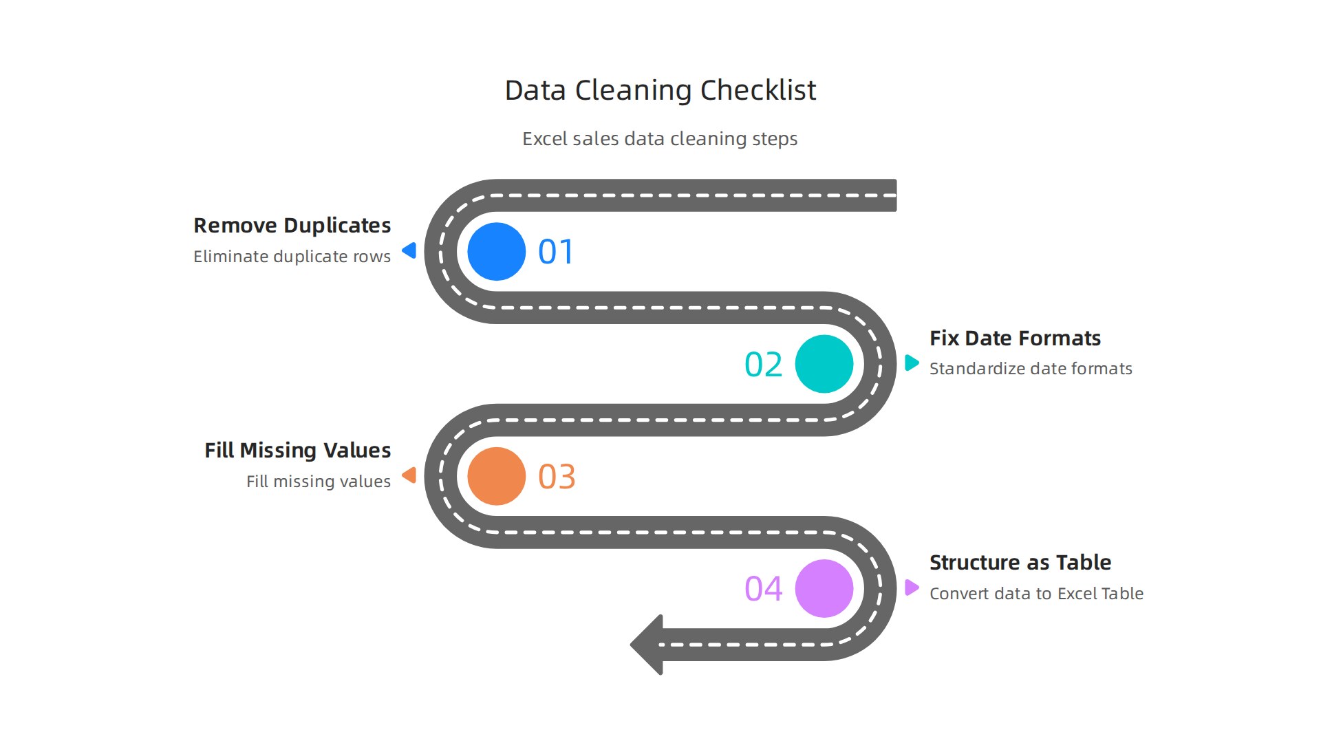
Remove duplicates first
Duplicate entries will mess up your pivot table totals and your forecast. You might count the same deal twice without realizing it. Excel makes this easy. Go to the Data tab and click Remove Duplicates. Our guide on how to remove duplicates in Excel for accurate sales commission calculations walks you through it step by step. This is one of the most important data cleaning tricks according to Microsoft Support.
Fix your date formats
This is a big one. If some dates are written as "03/15/2026" and others as "March 15, 2026", your pivot table will treat them differently. That breaks your timeline view and messes up your sales forecast. Make every date look the same. Use the Format Cells option or try power query for bulk fixes. The article on advanced data cleaning in Excel with Power Query hacks for 2026 shows you how to automate this.
Fill missing values and normalize text
Blank cells cause problems in pivot tables. They can make totals disappear or create empty rows. Fill in missing numbers with a zero or the average. For text entries like customer names, make sure everything is spelled the same way. "Acme Corp" and "Acme Corporation" should match. A little data cleaning software can help with this if you have a lot of records.
Structure your data as an Excel Table
This is the secret trick that experienced users love. When you convert your data into a formatted Excel Table (select your data and press Ctrl+T), magic happens. Any new rows you add later are automatically included when you refresh your excel pivot table. You never have to manually update the range. It just works.
Another useful skill for cleaning is knowing how to move columns in excel to reorganize your fields. And if you work with repetitive data, learning vba excel can automate entire cleanup routines for you.
Once your data is clean and structured, you are ready to build a reliable pivot table that powers your sales forecast with confidence.
Ready to put this into practice? Explore more resources and guides to help you sharpen your sales skills and increase your earnings.
Creating Structured References and Excel Tables
You already cleaned your data and turned it into an Excel Table. Nice work. But here is the thing. That table is way more powerful than you might think.
Excel Tables grow with your data
When you add new sales figures next week, your excel pivot table picks them up automatically. No range changes. No manual updates. Microsoft Support confirms this is a top way to keep your data clean and current. This is a huge time saver, especially if you build weekly sales forecast reports.
Structured references make formulas readable
Instead of seeing =SUM(C2:C100), you see =SUM(Sales[Amount]). That second formula tells you exactly what it does. It sums up the Amount column in your Sales table. This makes copying formulas across reports much safer. You reduce errors without even trying.
Why this matters for your workflow
Once your data lives in an Excel Table, you can build dynamic dashboards that update themselves. You can track your sales forecast in real time. You can even combine this with how to move columns in excel to reorganize your fields on the fly. And if you want to automate recurring data cleanups, learning vba excel lets you write macros that refresh everything with one click.
This setup is the foundation for clean, reliable analysis every single time.
Want to put these table tricks to use right now? View Articles that show you exactly how to sharpen your sales data skills.
Building Your First Excel Pivot Table for Sales Insights
You have your clean Excel Table ready. Now it is time for the fun part. Let us build your first excel pivot table and uncover real sales insights that help you earn more.
Here is the step-by-step process you can use right now.
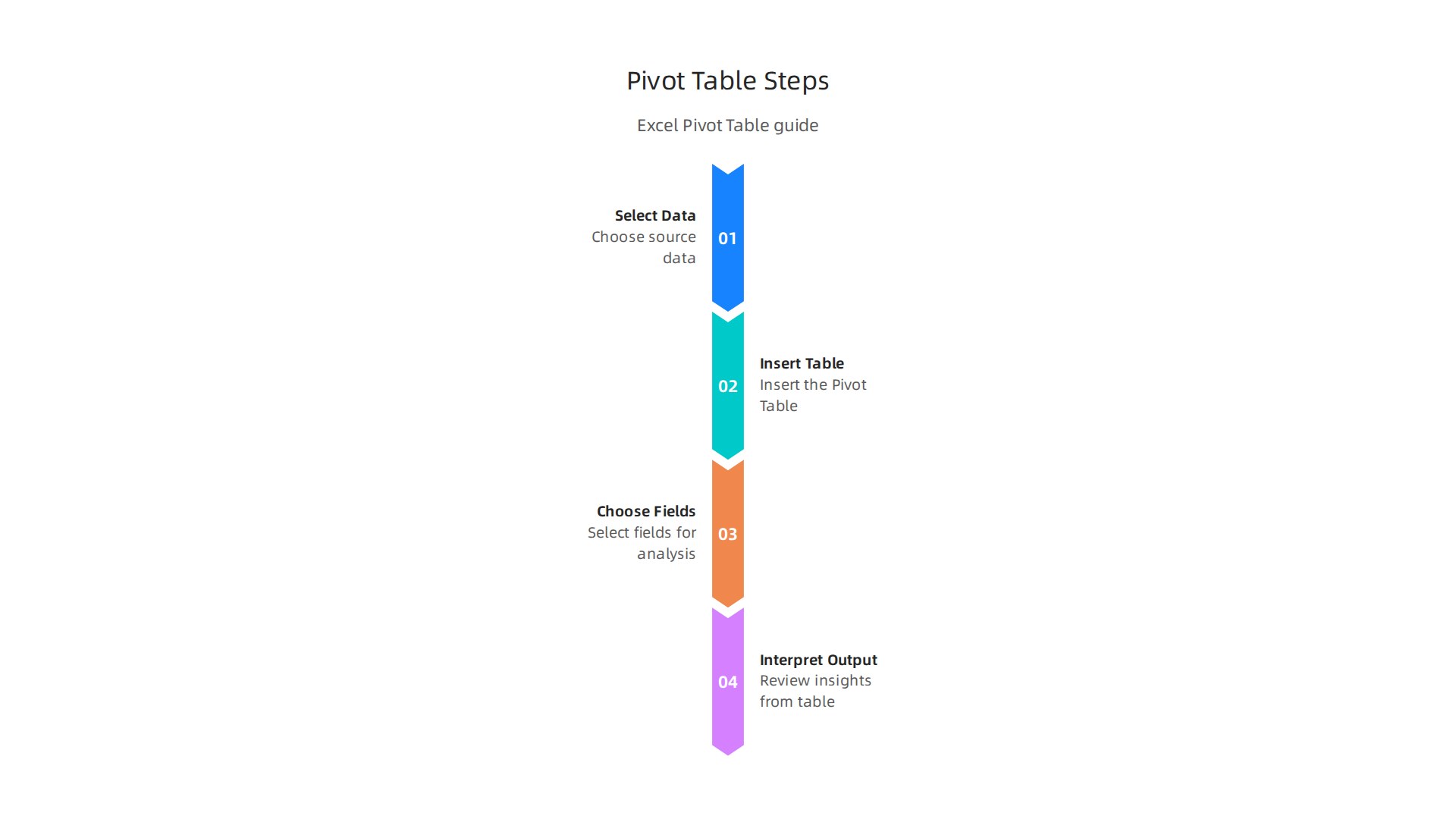
1. Select your data and insert the pivot table
Click anywhere inside your Excel Table. Then go to the Insert tab and click PivotTable. In newer versions of Excel, this shortcut is even faster. Excel will ask you where to put the report. Choose New Worksheet so your raw data stays clean. Microsoft Press Store explains that this basic setup is the starting point for all your analysis.
2. Choose meaningful fields for your commission report
This is where your excel pivot table really shines. Drag fields into these areas:
- Rows: This is for your categories. Think about sales rep names or product names.
- Columns: This works well for time periods like months or quarters.
- Values: This is where you put numbers. Drag your commission amount or total sales here.
- Filters: Use this to look at specific teams or regions.
For example, if you want to see which products sell best in each region, put Product Name in Rows, Region in Columns, and Total Sales in Values. That simple setup already shows you your winners and losers.
3. Interpret your output to spot opportunities
Once your pivot table is built, look for three things:
- Top performers: Who closed the most deals? Sort the Values column to see the highest numbers first.
- Best-selling products: Which items bring in the most revenue? Your Rows area shows this clearly.
- Seasonal trends: Use Columns for months and watch for patterns. Do sales spike in December? That is your cue to plan ahead.
This is the same approach that helps you build a stronger sales forecast every month. And if you want to understand the math behind your commission checks, learning to Master the excel percentage formula to calculate your sales commission is a great next step.
4. Add slicers for easy filtering
Slicers are buttons that let you filter your pivot table with one click. To add one, click anywhere in your pivot table, go to the Insert tab, and select Slicer. Microsoft Support shows you exactly how to use them. This makes your report interactive. Your manager or team can click a button to see only Q1 data or only the East region.
Your excel pivot table now answers your biggest sales questions in seconds. Want to put these tricks to work? View Articles that show you more ways to turn your sales data into cash.
Advanced Pivot Table Techniques: Calculated Fields and Slicers
You have already built a solid excel pivot table. Now it is time to unlock its full potential with a few advanced tricks that will save you hours of manual work.
Add calculated fields for deeper insights
Your raw data might show total sales and costs. But what if you need to see profit margin or commission percentage right inside your report? You do not need to change your source data. Instead, add a calculated field to your pivot table. This lets you compute new values like commission rates or per-unit profit on the fly. It turns your excel pivot table into a powerful commission calculator. If you are new to creating these formulas, our guide on how to Master the excel percentage formula to calculate your sales commission is a great place to start.
Use slicers for interactive reports
Slicers make your excel pivot table easy for anyone to use. Insert a slicer to add visual buttons that filter your data by region, product, or sales rep. This is perfect for team meetings where you need to switch views quickly. You can even connect one slicer to multiple pivot tables and charts to build a professional dashboard. No coding required.
Build different views from the same data
One of the best features is using the same source data to create multiple pivot tables. You can build one report for your sales forecast and another for tracking commission payouts. This keeps your raw data untouched while giving you flexible views. Learn more about setting up these systems in our guide on how to use Excel for commission income to track your sales pipeline and close more deals.
These techniques help you get the most out of every excel pivot table you build. Want to see more ways to turn your sales data into cash? View Articles for more actionable guides.
Forecasting Future Sales with Excel’s FORECAST Functions
You have already built a solid excel pivot table that summarizes your past sales. Now you need to know what comes next. Instead of guessing, you can use Excel’s built-in FORECAST functions to predict future numbers based on your history.
The star is FORECAST.ETS. This function uses an exponential triple smoothing algorithm that automatically handles trends and seasonal patterns. If your sales peak every December and dip in January, FORECAST.ETS spots that rhythm and adjusts its predictions. The Journal of Accountancy explains how the ETS method "creates forecasts that can include trend and seasonal components." No complex math required.
How to start forecasting
First, make sure your historical data is clean. Remove duplicates and fill in missing months. You can learn how in our guide on cleaning data for accurate sales commission calculations. Then follow these steps:
- Summarize your monthly sales using your excel pivot table.
- Copy the pivot table’s monthly totals into a new sheet with dates in one column and values in the next.
- Use
=FORECAST.ETS(target_date, values, timeline)to project the next few months.
This method works great for building a sales forecast that you can update every month. For a full walkthrough, check out Resourceful Finance Pro’s guide on preparing data and visualizing trends.
Add trendlines to your charts
After you get the forecast numbers, add them to a line chart. Then right-click the data series and add a trendline. This shows you and your team exactly where the numbers are heading in a single glance.
Combine pivot tables with forecasting
Here is the real power: use your pivot table to view sales by rep, product, or region, then forecast each slice separately. You can prioritize which reps or territories need more attention. Our guide on how to use Excel for commission income to track your sales pipeline shows you how to connect these views.
Want to dig deeper into turning your data into cash? View Articles for more actionable forecasting tips.
Building a Real-Time Commission Tracker Dashboard
Forecasting future sales is great. But you also need to see where you stand right now. That is where a real-time commission tracker dashboard comes in.
Think of your dashboard as a command center. It puts all your key numbers in one place. You can see your total sales, commission earned, conversion rate, and average deal size without opening multiple sheets. The top sales performance metrics that top teams track in 2026 include these exact KPIs.
Your excel pivot table is the heart of this dashboard. It gives you live data that updates when you refresh. From there, you add charts and conditional formatting to make trends pop.
How to build your dashboard
Start with a blank sheet. This will be your dashboard view. Then follow these steps:
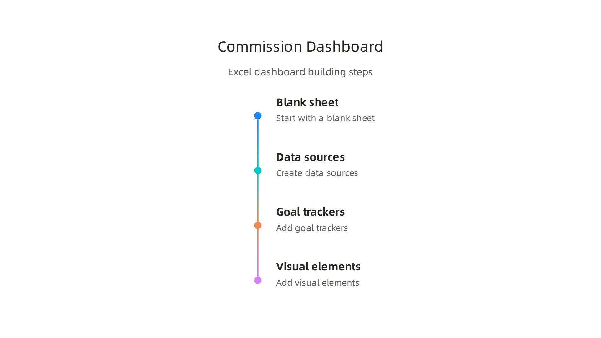
- Create your data sources. Use your excel pivot table to summarize sales by rep, product, or month. Place each pivot table on its own sheet.
- Pull in your KPIs. Use formulas to grab the numbers you care about most. For example, you can calculate commission earned using our guide on the Excel percentage formula.
- Add goal trackers. Set monthly targets and use a simple formula to show progress. Our guide on how to set your target sales number can help you choose the right goals.
- Use simple lookup formulas. Add a commission calculator with
=VLOOKUPor=XLOOKUPto pull commission rates based on deal size or product type. This turns your dashboard into a live calculator.
Make it visually clear
Charts and conditional formatting turn boring numbers into instant insights. For example, use a green-yellow-red color scale on your conversion rate. A red cell tells you a rep needs help without reading a single number. You can also add a bar chart showing each rep’s progress toward their monthly goal.
Sales commission spreadsheets work best when they show you problems before they grow.
Keep it updated
Here is a small trick. Use a VBA script to refresh your excel pivot table every time you open the file. That way your dashboard always shows the latest data without manual clicks.
Your sales forecast from the previous section can also feed into this dashboard. Add a small box that shows your forecasted vs actual numbers. Now you have both a rearview mirror and a windshield in one view.
Want more ideas? View Articles for guides on tracking your pipeline and closing more deals.
Avoiding Common Mistakes in Sales Data Analysis
Your dashboard looks great. But even the best excel pivot table can lead you astray if you make a few common errors. Let me walk you through the three biggest traps I see sales teams fall into.
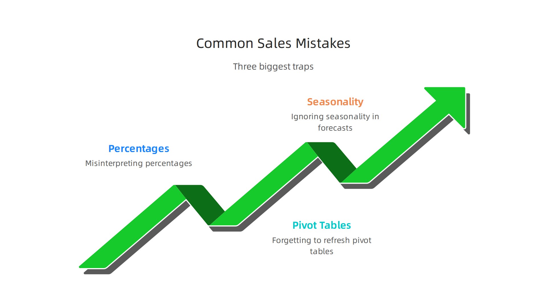
Mistake 1: Misreading your percentages
Here is a classic one. You look at a pivot table and see that a rep accounts for 35% of something. But 35% of what? If you run a % of column when you meant % of total, your numbers lie to you. This is one of the most common Excel data analysis mistakes that quietly undermine business decisions every day.
The fix is simple. Before you share a pivot table report, double check which percentage setting you chose. Right click the value field, go to Show Values As, and pick the right option. If you want to compare each rep against the whole team, use % of Grand Total. If you want to see how each rep performed within their region, % of Column makes sense.
Mistake 2: Forgetting to refresh your pivot table
You add new sales data to your source sheet. Your pivot table still shows last week’s numbers. You make a decision based on stale data. This happens all the time. Many common mistakes in data analysis happen during the setup stage and stick around because nobody checks.
Get into a refresh habit. Right click your pivot table and select Refresh. Better yet, use a vba excel macro to refresh everything when you open the file. This is a tiny fix that saves you from big errors.
Mistake 3: Ignoring seasonality in your sales forecast
You look at three months of data and assume that pace will keep up all year. Then December hits and your numbers drop because your industry always slows down in winter. Using too little data or the wrong trend model makes your sales forecast unreliable.
Always pull at least 12 months of historical data before forecasting. Look for patterns. If you sell coaching packages, you might see spikes in January when people set New Year goals. If you are in real estate, summer might be your peak.
Want to dig deeper into forecasting? Learn how the CAGR formula in Excel helps you see true growth over time.
Avoid these three traps and your data analysis will actually help you sell more. Need more help cleaning up your numbers? Read Articles for step-by-step guides on keeping your data accurate and actionable.
Integrating Excel with CRM Systems for Seamless Analysis
Your CRM holds all your sales data. Your excel pivot table can turn that data into real insights. But if you are still copying and pasting reports by hand, you are wasting time and risking errors. Let me show you a cleaner way.
Start with a simple export
Most CRMs let you export your data to a CSV or Excel file. Once you have that file, open it in Excel and run your usual cleanup. Remove duplicates, fix date formats, and check for blank cells. This is where knowing how to move columns in excel helps you rearrange fields so your pivot table makes sense. Exporting works fine for one off reports, but it gets old fast.
The better way: Power Query
Power Query lets you connect directly to your CRM without manual exports. You set up the connection once, choose the tables you need, and refresh with a click. Excel pulls fresh data straight from your CRM every time. This cuts down on the kind of data import problems that break your analysis.
Automate updates with VBA
If you run the same sales report every week, a vba excel macro can refresh your queries, update your pivot table, and even email the report. No more forgetting to refresh. Your sales forecast stays current because the macro handles the grunt work.
Setting up this integration takes maybe an hour. But it saves you hours every month and keeps your data accurate. Want to see how this fits into a full commission tracking system? Read Articles for step by step guides on building automated reports.
Summary
This article shows commission-based sales professionals how to turn messy spreadsheets into actionable insights using Excel—starting with clean, structured data and ending with a live commission dashboard and forecasts. You’ll learn practical prep steps (remove duplicates, fix dates, fill blanks) and why converting your range into an Excel Table and using structured references reduces errors and saves time. The guide walks through creating your first pivot table, choosing rows/columns/values, adding slicers, and using calculated fields to measure commission and margins. It then explains how to forecast with FORECAST.ETS, visualize trends, and combine pivot slices to prioritize accounts. Finally, it covers automation and CRM integration (Power Query, VBA) and common traps—so you can produce accurate forecasts, refreshable reports, and dashboards that help you sell smarter and increase commission income.